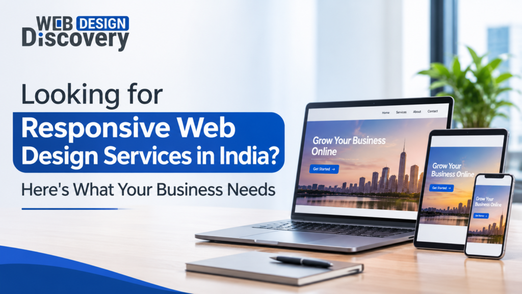
With responsive web design, your website will be automatically optimized in terms of layout, content and functionality. It helps to give visitors a similar experience using any of the devices such as mobile phone, tablet and computer. As far as the case of Indian entrepreneurs is concerned, it becomes necessary for them to have a website that is easy to navigate for the visitor irrespective of his or her device.
No matter whether you are starting a new venture, a small businessman or managing a company, you can definitely go for professional responsive web design services which can help you boost your online presence. But it should be noted that opting for responsive design is not just about fitting into a smaller screen.
Why Indian Businesses Need Responsive Web Design
Consumers in India have access to websites via different gadgets and internet connection types. While one consumer may find out about a business using Google from a smartphone, another consumer will visit it from a laptop after some time. Your website should offer consistency in both cases.
Here are some reasons why responsive web design is important for businesses in India:
Reach mobile users: Consumers will be able to visit your website, view details of products and services, and get in touch with you through their smartphones.
Better customer experience: Information will be more accessible due to content, images, buttons, and navigation adapted to different screen sizes.
Generate leads: Adequate placement of enquiry forms, contact buttons, and calls-to-action will allow consumers to make the next move.
Website management made it easier: A single responsive website is simpler to manage than separate desktop and mobile websites.
Grow your business: A flexible website will have enough room for more pages, services, and other elements if you need to expand.
For instance, the website of a real estate business should have property images, specs and enquiry forms suitable for viewing on a mobile screen. Likewise, online shopping should be convenient for consumers with smartphones.
What Is Included in Professional Responsive Web Design Services?
The Professional Responsive Web Design Services consist of planning, designing, developing and testing a website that would work effectively in various screen sizes.
Based on your business needs, a full service could be comprised of:
1. Custom Website Design
Custom design should reflect your business brand, offers and target audience. It uses proper layout, fonts, colors and visuals instead of using any templates.
2. Mobile-First Website Development
A mobile-first approach means first creating a website for small devices and then expanding its layout to tablets and desktops. Such an approach allows you to focus on the most relevant content and functionality for mobile users.
3. Website Redesign and Optimization
If there is some overlap in content, complicated navigation and bad display of pictures in your existing website on mobile phones, website redesign will solve all these problems and optimize usability of your site.
4. WordPress and Shopify Development
Your business can use a responsive WordPress website if you need a CMS solution or a Shopify store if you want to sell something online.
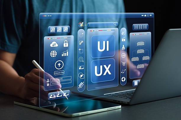
5. UI/UX Design and Navigation
User interface and user experience planning ensure that menus, forms, buttons and other interactive elements remain accessible and convenient across devices.
6. Website Speed and Technical Optimization
Image optimization, efficient coding, browser compatibility and performance improvements help create a smoother browsing experience.
Essential Features of a Responsive Business Website
Responsiveness is not limited to making the desktop website design fit into a mobile phone screen. A responsive website is one that adapts to fit the space it is using.
The following are some of the key characteristics of a responsive website:
Flexible Layouts: Web page designs change with the available width without causing horizontal scrolling.
Responsive images: Web page images change proportionately in terms of image size and resolution.
Mobile-friendly navigations: Web page menus adapt to mobile screens through simplified navigation systems.
Good typography: Fonts and spaces between them remain comfortable for all screens.
Buttons are touch-friendly: Buttons and links have adequate spaces for touch-based operation.
Functional consistency: All interactive tools like forms, dropdowns and search engines work for all supported browsers and devices.
Compatibility with all major web browsers and screen sizes: Testing of the website for all major browsers.
The following features are important for an Indian business website in cases where customers are searching services, comparing products or placing enquiries while traveling.
How Responsive Web Design Improves Mobile User Experience
Many mobile users require information that is specific to their needs without having to navigate through different web pages to find it. In case the texts on your website are too small, there are too many links and menus to look at, or you have complicated forms, many people will leave the site without contacting you.
Responsive website design solves all these issues by making the site adapt to the screen of the device being used.
Imagine that someone is looking for a digital marketing agency. Using their smartphone, it should be possible to see the services provided by the agency and the portfolio and click the button to make an inquiry without having to zoom or scroll sideways each time.
The same goes for the customer who is shopping online; they should be able to see pictures of products and make a purchase without any navigation hassle.
Responsive Web Design and SEO: What Businesses Should Know
Responsive design helps websites become SEO-friendly in terms of providing an identical experience on all the devices. In addition, Google will use the mobile version of website content for indexing via mobile-first indexing, which makes mobile accessibility essential for SEO purposes.
Nevertheless, responsive design itself doesn’t mean that the ranking of websites will be better. SEO-friendly design should be used in combination with proper technical SEO and content creation.
Here are some tips:
Mobile-first indexing: Make sure that important content, metadata, structured data and internal links are present on the mobile version.
Page load time: Optimize images, get rid of any useless scripts and improve the performance of servers.
Core Web Vitals: Pay attention to Largest Contentful Paint (LCP), Interaction to Next Paint (INP) and Cumulative Layout Shift (CLS).
Website structure: Make sure that navigation is logical, URLs are informative and there is a clear internal linking strategy.
Image optimization: Use correct image sizes and new file types when possible.
Usability: Important elements of the website should be easily accessible for users.
All those factors will help search engines understand your website while providing a good experience to your customers.
How to Choose the Right Responsive Web Design Company in India
Selecting an experienced responsive web design company in India is an important decision because your website directly represents your business online.
Before finalising an agency, consider these factors:
Review its portfolio: Examine previous website projects to understand the agency’s design quality, industry experience and ability to handle different requirements.
Check technical expertise: Ask whether the team works with responsive frameworks, modern HTML and CSS, WordPress, Shopify and performance optimisation techniques.
Understand its design process: A reliable agency should discuss your business goals, target audience, website structure and functionality before starting development.
Ask about testing: Confirm whether the website will be tested across different screen sizes, browsers, forms and interactive elements before launch.
Consider SEO requirements: Your website should have a search-friendly structure, accessible content and technically sound development.
Check post-launch support: Ask about maintenance, security updates, troubleshooting and future improvements.
Compare agencies based on their technical capabilities, communication and project approach rather than choosing solely on the lowest quotation.
Why Consider Webdesign Discovery for Responsive Web Design?
Webdesign Discovery offers responsive web design solutions for companies wishing to develop their website. The company’s process consists of custom design, mobile-first development, and UI/UX planning along with technical optimizations in order to deliver websites that operate on various devices.

Services offered by the company include custom responsive website design, website redesign, WordPress development, Shopify store design, and maintenance of the website.
Among other things, website speed, SEO-ready development, Core Web Vitals, and conversion layout is considered by the team of Webdesign Discovery in order to provide website solutions based on unique business needs and goals.
If you need to create a responsive website for startups, a service business, or an ecommerce website, proper website design and development could make a big difference.
Frequently Asked Questions
1. What is responsive web design, and why is it important?
Responsive web design is an approach that allows a website to adjust its layout and functionality according to the visitor’s screen size. It is important because it improves usability across smartphones, tablets and desktops while supporting mobile accessibility and SEO.
2. How much do responsive web design services cost in India?
The cost depends on website size, design complexity, required features, development platform and integrations. A basic business website generally requires a different investment from a customized ecommerce platform. Requesting a project-specific quotation is the best way to understand the cost.
3. Is responsive web design important for SEO?
Yes. Responsive design supports mobile-first indexing and helps provide consistent content across devices. However, search performance also depends on content quality, technical SEO, website speed and other ranking factors.
4. What is the difference between responsive and mobile-friendly website design?
A responsive website automatically adjusts its layout to different screen sizes. Mobile-friendly website design is a broader term describing websites that are easy to use on mobile devices. A responsive layout is one effective way to achieve mobile usability.
5. Can an existing website be converted into a responsive website?
Yes. An existing website can be redesigned or updated to support responsive layouts. The work may involve changing its structure, CSS, navigation, images and interactive elements. The exact requirements depend on the website’s current technology and condition.
6. How long does it take to develop a responsive website?
The timeline depends on the number of pages, design requirements, functionality, content availability and testing. A relatively simple business website may take a few weeks, while complex websites and ecommerce projects can require more time.
Conclusion
It is crucial for companies wishing to build a practical and efficient web presence to invest in Responsive Web Design. From enhancing mobile usability, to providing technical SEO and easier website administration, a professionally designed responsive website will better cater to your needs.
What matters most here is to select a design and development firm that would meet your business needs and not just build a site that adapts to varying screen sizes.