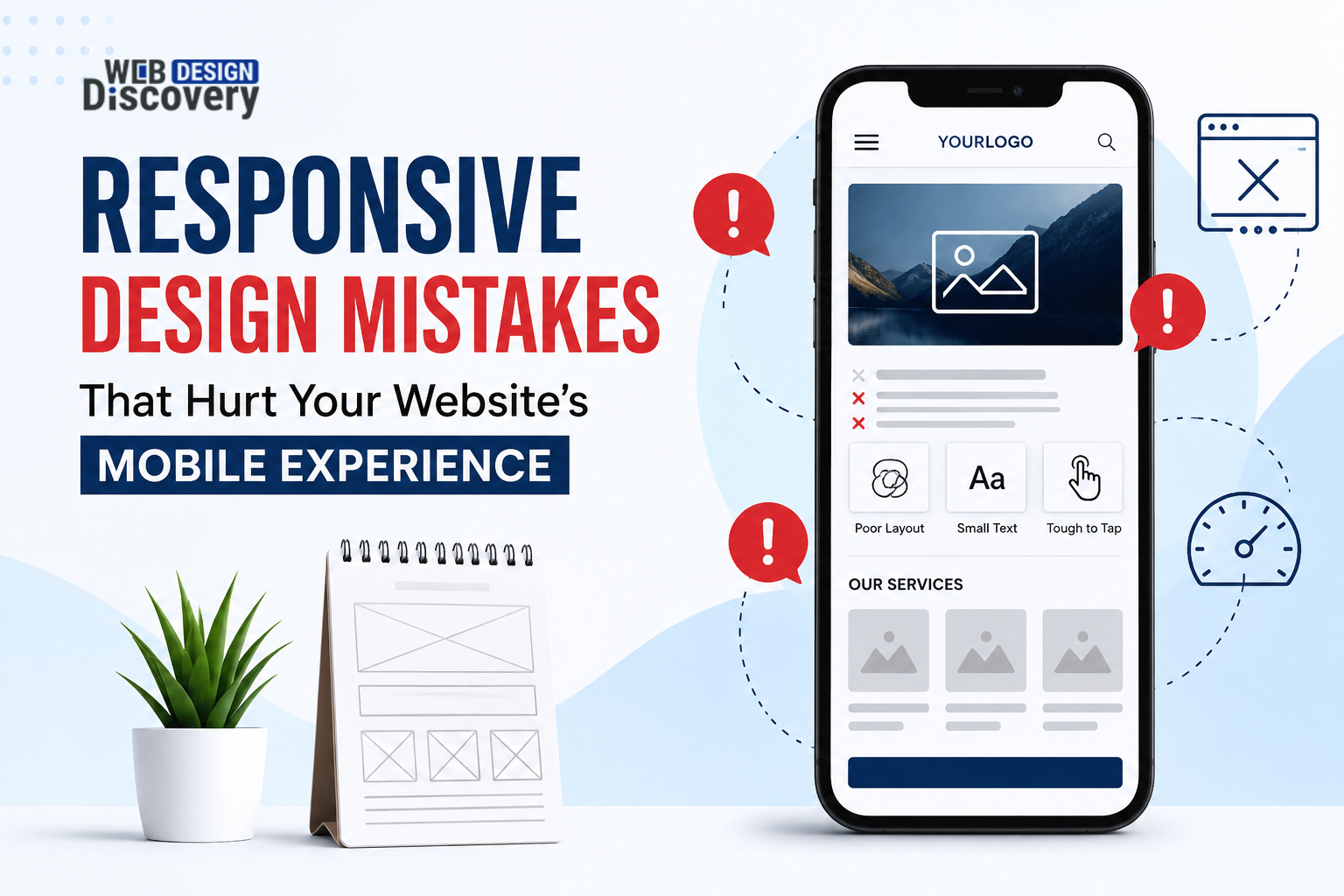
Even if a website looks good on a desktop, it may not be the case on phones. This difference arises due to lack of responsive designs. Users are not willing to deal with the problems of a web page that requires pinching, zooming, searching for buttons and loading of content. Poor usability means high bounce rates, less enquiries, decreased trust and poor site performance. This guide will discuss some important responsive web design mistakes that we need to avoid for the best outcomes.
With responsive design, a website will be able to automatically adjust its layout, content, pictures, navigation and interaction to the size of the screen used. Rather than creating a different layout for each type of device, the developer creates one flexible layout that works well on any size of screen.
It is not about making a page smaller. It is about making a mobile experience clearer and better.
There is a need to check common mistakes before hiring affordable responsive web design services.
There is plenty of space in the layout of desktops to place additional elements. When this layout is displayed on a phone, there will be overcrowded text, hidden elements such as buttons, and lost essential information.
Test designs on mobiles at various phases of creating layout designs, not only the final product.
The user visiting your website from a mobile should not have difficulties finding your menu, buttons, products or services. Insignificant icons, misleading labels and oversized navigation will be irritating.
Keep mobile navigation straightforward and comfortable to tap.
High-quality images may seem perfect, but they can increase page loading time, especially on mobile pages.
Optimize the images in terms of compression, format selection, and asset size. Avoid forcing phones to load images designed for desktops.
Inadequate font sizes, long lines, and bad contrast on mobile pages make the reading experience complicated and tiring.
Use clear font sizes, reasonable line height, and proper spacing.
The desktop user clicks with accuracy; the mobile user taps using their fingers. Buttons and links that are too close together may lead to tapping errors.
Design your calls-to-action to be clear and easily accessible to users. Ensure there are sufficient spaces between touch controls.
Responsive design is closely related to performance. Scripts, animations, large files, and code that isn’t optimized will lead to a slow mobile site.
Regularly check your page speed. Clean up your pages, optimize the media on them and minimize scripts.
Even small issues related to usability can trigger a cascade effect. A user might have trouble reading a heading, locating a button, waiting for an image to load, and leaving without making their inquiry.
Unfavorable mobile usability can negatively affect engagement and conversion rates. E-commerce websites will suffer from fewer purchases. Service companies will get less calls, forms filled, and appointments made.
Begin by asking what the mobile visitor would most probably do on that page, and then make the task easily accessible.
Make use of flexible grids, scalable images, and breakpoints based on requirements, not on a list of devices. Be sure the layout is clear and that spacing is consistent.
Test your forms, menus, buttons, images, videos, and interactive elements across a range of screen sizes. The real devices will uncover usability problems related to touch, loading times, and readability.
Companies looking for cost-effective responsive web design services should ask their service providers about their approach to testing and other issues aside from aesthetics.
Webdesign Discovery concentrates on usable websites rather than only screenshots. Responsive web design must take into consideration screen size, behavior of users, navigation, performance, and business requirements.
The first step in the process is the target audience and what you want from your website. This way, layouts and content will help define good user experiences. It will be taken into account when designing and testing mobile screens, not at the very end.
If your website does not seem to work well on mobile phones, Webdesign Discovery will assist you with the layout, usability, and performance problems.
Responsive design does not merely mean resizing a desktop version of a website for the phone screen. It involves having proper navigation, legible text, flexible layout, fast assets and comfortable interactions.
Avoiding typical mistakes may help to make your mobile experience better while also considering usability, conversions and performance of the website. If it is hard to use your website on a phone, reviewing responsive web design of your site might be a good idea.
1. What is the importance of responsive design for a business?
It makes your website usable on phones, tablets and desktops. Better usability may contribute to higher engagement, conversion and trust.
2. How can I check whether my website is mobile-friendly?
Test main pages on phones and tablets. Evaluate navigation, text, forms, buttons, images, loading speed and possibility to perform the important actions without zooming.
3. Is responsive design good for SEO?
Mobile friendliness may contribute to search performance due to usability and page experience being important for users. Still technical SEO, useful content, accessibility and performance matter too.
4. What is the biggest mistake in responsive design?
It is hard to say which mistake is the worst for all websites. But not testing real mobile experience is something that happens quite often because the main focus is on desktop screens.
5. What is the price of responsive web design services?
It will depend on the site’s size, functionality, content, integration needs, and whether there is a need for complete redesign.
6. Can an already existing website be made responsive?
Usually, yes. Some sites may only require reworking their layouts and CSS, while others, especially old and messy ones, may require a bigger redesign.
 +91 9465573673
  creative_preet
  info@webdesigndiscovery.com