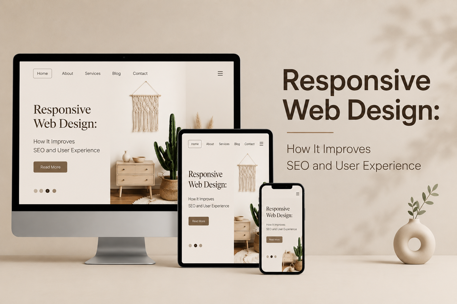
In today’s scenario, people expect your website to be fast loading, attractive in looks, and work seamlessly irrespective of the device being used. Whether the user is accessing from his smartphone, tablet, laptop or PC, the experience on your website should be the same. This is where Responsive Web Design plays an important role.
The responsive web design ensures that your website adjusts automatically according to screen size without requiring any separate versions for mobiles and desktops. Moreover, responsive web design has an impact on SEO and conversion rates.
If your website is not mobile friendly then there is a high possibility that you may lose traffic and leads due to search visibility issues. With responsive web design services, companies can gain a competitive edge and ensure that they keep up with the latest SEO ranking factors by Google.
So, let us talk about the importance of responsive web design in SEO and user experience.
Responsive Web Design is a web design methodology that helps the website automatically adapt its layout, navigation, images, and contents to the visitor’s device and screen size.
Rather than having two different sites, one for mobiles and one for desktops, a responsive design employs fluid grid layouts, scalable images, and CSS media queries to present one optimized site on all devices.
The benefits of a responsive website include:
Google is now moving towards mobile-first indexing. This implies that Google considers the mobile version of your website while ranking the pages.
There are several aspects of SEO for which the responsive website provides proper support.
1. Mobile First Indexing
Over 50% of the world’s web traffic is done through mobile devices. As Google considers the mobile version first, those websites that have problems in terms of their mobile version cannot do well in rankings.
The responsive website helps you have:
This will help you have a better future regarding SEO results.
2. Better Page Experience
In Google’s ranking systems, websites that offer good user experience are favored.
The responsive websites help in providing:
Web users leave a site very fast when web pages fail to render properly on their devices.
Consider a user who is looking for a local business through his/her mobile device. Text overlaying, tiny buttons, and non-functional images will definitely prompt the user to exit in a few seconds.
A responsive website keeps users engaged by ensuring that surfing through the site becomes easy.
Low bounce rates tend to result in the following factors:
4. One URL for All Devices
A Responsive Design works with a single URL, despite the type of device used.
Advantages of this factor include:
SEO brings visitors, but user experience is responsible for making them stick around and convert.
Improved Website Loading Speed
Speed is critical.
The internet user expects a page to load in seconds. Responsive websites adapt their layout, pictures, and coding to decrease unnecessary loading time.
Faster websites tend to have:
Easy Website Navigation Across Devices
Navigation optimized for desktop computers may be inconvenient when viewed on smaller devices.
Responsive websites have:
The user finds necessary information easily.
Improved Website Readability
Responsive websites adapt their typography and space according to different screen size.
Visitors do not have to:
Brand Consistency
Whether your visitor visits your website from their laptop at work or checks your website later on their phone, they want an experience that feels consistent.
Consistency builds:
Brand consistency is extremely important for companies generating leads online.
A beautiful website is nothing without conversion.
A responsive website will increase conversions by enabling people to do the following:
In this case, consider an e-commerce website which hides the purchase buttons on mobile devices. Customers are likely to leave.
Responsive purchase processes eliminate the above limitations and encourage completed transactions.
Local SEO is performed mainly on mobile devices.
People tend to look for:
If your website is not mobile-friendly, you might miss out on many prospects who are looking to contact you.
Responsive web design helps in local SEO by making it easy for users to:
Even businesses that have responsive websites may neglect some aspects.
The most common mistakes include:
Constant testing through various devices can reveal such problems.
There are many website builders that offer responsive templates, yet proper optimization involves more than just reducing content for smaller screens.
Professional Responsive Web Design Services specialize in:
The professional team guarantees that your website stays updated according to the changes in technology and Google algorithms.
In case you plan to redesign a website or build a new one, using professional Responsive Web Design Services will be helpful.
Find out more about our Responsive Web Design Services and create a website that provides great user experiences and helps with your SEO.
Responsive Web Design can no longer be an option; instead, it should be considered a fundamental aspect of doing business online. A responsive website enhances usability, improves SEO, supports mobile-first indexing, and ensures a consistent experience on any device.
As the priority of search engines becomes the experience of users, companies who utilize professional Responsive Website Design will have an easier time attracting, retaining, and converting visitors.
From developing a brand-new website to refreshing an old one, the advantages of Responsive Design apply to everyone involved.
Ready to grow your business online? Partner with Webdesign Discovery for professional Responsive Web Design Services that enhance SEO, user experience, and conversions.
What is Responsive Web Design?
Responsive Web Design is a way to ensure that websites are able to dynamically adapt to various screen resolutions and devices.
2. Is Responsive Design good for SEO?
Absolutely. Responsive Design is helpful for mobile-first indexing, improving the experience of users, reducing bounce rates, and efficient crawling of your website by search engines.
3. Why is Responsive Website Design necessary for business organizations?
It will help the users to have an optimal experience when browsing through any device.
4. What effect do responsive designs have on page speed?
The loading of a page becomes more effective due to flexible layout, optimized images, and optimized coding of the responsive website.
5. Should one use the responsive design, or create mobile and desktop versions of the website separately?
One should opt for responsive design because it is cost-effective and offers consistency.
6. When is it time to start investing in Responsive Web Design Services?
If the existing website is not compatible with mobile or takes time to load, then you should start thinking about Responsive Web Design Services.
 +91 9465573673
  creative_preet
  info@webdesigndiscovery.com